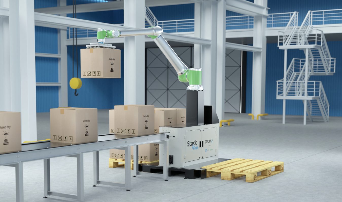
About the project.

I was asked to design a logo for the Stack Mate palletising solution.

The palletising solution logo needed to represent the x3 partner brand colours; Onrobot (grey) Schneider Electric (green) Tech Via (blue).

The Solution

Utilising the OnRobot brand guidelines as a foundation for the typography, this informed the font choice for ‘Stack’. The handwritten style introduces a human element, reinforcing the idea of personalisation within the palletising solutions.

The project explored two logo concepts, with the selected option approved quickly and without amendments. Print-ready assets were supplied, including correctly prepared files for laser cutting, ensuring the design was fully ready for implementation on the palletiser.

The Value

Expertise and experience led to fast approval = reduced client stress.

Seamless transition from concepts to design & production.

Implementation-ready outcome and supplied correct print ready files.

A happy and reoccurring client.

Previous
Previous

Vikand Brand Identity Refresh

Next
Next

Video Showreel